




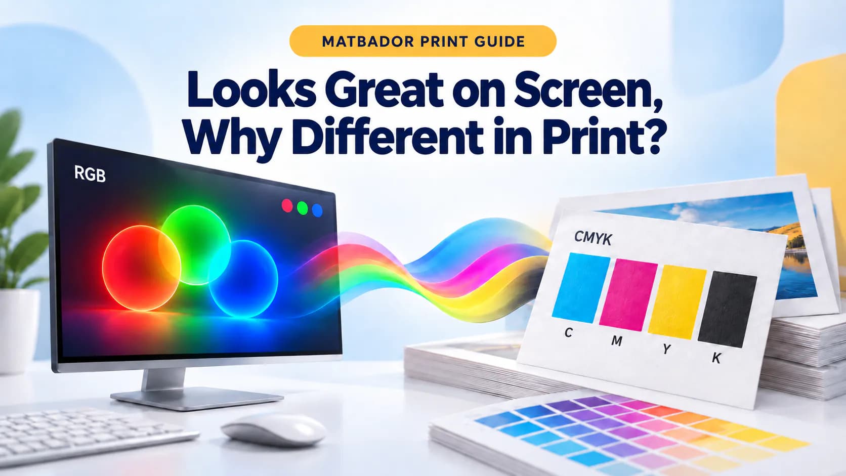
Looks Great on Screen? Understanding CMYK and RGB
Looks Great on Screen—Why Does It Look Different in Print? Let’s Talk CMYK and RGB
Your design looks bright and vibrant on your computer or phone screen. The blues are vivid, the yellows glow, and the reds look exactly as you imagined. But when the finished product arrives from the printer, you may notice that some colours look slightly different.
Don’t worry—your printer hasn’t fallen out with your colours. 😊
The main reason is simple: screens and printing machines create colours in completely different ways. Digital screens generally use the RGB colour model, while professional printing relies on CMYK.
Let’s introduce these two colour worlds and explore how you can prepare your artwork for a more predictable and professional print result.
What Is RGB?
RGB stands for the three colours used to create digital images:
- Red
- Green
- Blue
Phones, computers, tablets and televisions create colours using light. By combining red, green and blue light at different intensities, screens can display millions of colours.
Because screens produce their own light, RGB colours can appear particularly bright, vivid and eye-catching.
The RGB colour model is ideal for:
- Websites
- Social media graphics
- Digital advertisements
- Mobile applications
- Email designs
- Digital presentations
- Videos and animations
- Any design intended to be viewed on a screen
In short, if your design will only be used digitally, RGB is the right choice. When that design is going to be printed, however, the colour rules begin to change.
What Is CMYK?
CMYK represents the four inks commonly used in professional colour printing:
- Cyan
- Magenta
- Yellow
- Key/Black
Printing machines combine these four inks in different proportions to reproduce the colours in your design on paper, card, vinyl and other printable materials.
Artwork for products such as business cards, leaflets, brochures, catalogues, posters and labels should generally be prepared in the CMYK colour mode.
Unlike a screen, printed material does not produce light. The inks absorb and reflect the light around them, which means printed colours can naturally appear softer or less luminous than the same colours displayed on a bright screen.
What Is the Main Difference Between RGB and CMYK?
The easiest way to understand the difference is this:
RGB creates colour with light. CMYK creates colour with ink.
A digital screen can produce very bright and intense colours because it emits light directly towards your eyes. Paper cannot do this. It simply reflects the light falling onto its surface.
For this reason, an extremely bright RGB colour may appear slightly darker, softer or less saturated when converted to CMYK and printed.
The difference is often more noticeable in:
- Neon colours
- Fluorescent shades
- Bright blues and greens
- Intense pinks and purples
- Highly saturated gradients
- Colours designed to look illuminated on a screen
This does not necessarily mean there is a printing fault. Some colours that exist within the RGB colour range simply cannot be reproduced exactly using standard CMYK inks.
Is Converting the Design to CMYK at the End Enough?
It is possible to create a design in RGB and convert it to CMYK before printing. However, simply changing the colour mode does not guarantee that every colour will remain exactly the same.
During conversion, colours that fall outside the printable CMYK range are adjusted to the nearest available alternative. As a result, certain areas may appear:
- Less vibrant
- Slightly darker
- Softer
- Less saturated
- Different in tone
The safest approach is to prepare print artwork in CMYK from the beginning. This allows you to review the colours throughout the design process and make adjustments before submitting the file.
If you receive an existing RGB design, convert it to CMYK and check every important brand colour, image and gradient carefully before exporting the final artwork.
Why Does Black Sometimes Look Grey in Print?
Black is another colour that can behave differently in print.
A black made using only the black ink channel may look clean and sharp, but it can appear softer or slightly grey across a large printed area. For deep black backgrounds, printers may use a carefully balanced combination known as rich black.
Rich black combines black ink with selected amounts of cyan, magenta and yellow to create a deeper appearance.
However, rich black should not be used everywhere.
When four inks are used for small text or thin lines, even a tiny registration movement between the colours can reduce sharpness. For this reason:
- Small black text should generally use the black channel only.
- Fine black lines should normally be kept as single-colour black.
- Large black backgrounds may use a suitable rich-black mixture.
- The correct values should be confirmed according to the product and printing method.
There is no single black formula that works perfectly for every material and production process.
Will Printed Colours Look Exactly the Same as They Do on Screen?
The short answer is: not always.
Even two screens can display the same design differently. A bright phone may show the colours as highly saturated, while an older or uncalibrated monitor may display them as darker or less vivid.
The final printed appearance can also be influenced by:
- Screen brightness and calibration
- The colour profile used in the artwork
- The whiteness and texture of the paper
- Coated or uncoated paper
- Matt or gloss lamination
- The type of ink and printing process
- Lighting conditions
- Surface coatings and special finishes
For example, gloss lamination can make colours appear brighter and more saturated, while matt lamination usually creates a softer, smoother and more understated appearance.
This is why an ordinary phone or computer screen should not be treated as an exact print-colour reference.
If precise brand colour consistency is essential, use approved colour values and consider requesting a printed proof before full production.
Does the Type of Paper Affect Colour?
Yes. The selected paper or material can significantly affect the final result.
Colours printed on bright white coated paper may appear cleaner and more vivid. The same colours printed on natural, cream-coloured or uncoated paper may look warmer and more subdued.
Ink can also behave differently depending on the surface. Coated paper keeps more ink near the surface, while uncoated paper absorbs more of it. This can affect:
- Colour vibrancy
- Contrast
- Image sharpness
- Fine details
- The appearance of dark areas
When choosing a material, consider not only its thickness and texture but also how it will interact with your design.
Check This List Before Sending Your Artwork to Print
Before uploading your final file, review the following points:
- Is the document set to CMYK colour mode?
- Are the images high enough in resolution?
- Have the fonts been embedded or converted to outlines?
- Are important text and logos kept away from the cutting edge?
- Has the required bleed been added?
- Are the black values suitable for the design?
- Have important colours been checked after CMYK conversion?
- Is the artwork exported in the requested print format?
- Are all images, spelling and contact details correct?
- Has the final PDF been reviewed before submission?
These simple checks can greatly reduce unexpected results and help prevent the familiar surprise of saying, “That isn’t how it looked on my screen.”
Great Print Starts with a Properly Prepared File
A high-quality print result depends on more than the printing machine. It begins with correctly prepared artwork.
Understanding the difference between RGB and CMYK helps you create more predictable colours across business cards, brochures, leaflets, posters, labels and many other printed products.
At Matbador, you can choose your product, configure its printing options and upload your print-ready artwork in just a few simple steps.
You create it—we’ll bring it to print. Design, print, grow.
Frequently Asked Questions
Should I use RGB or CMYK for printing?
Artwork intended for professional printing should generally be prepared in CMYK. RGB is mainly used for designs that will be viewed on digital screens.
Can an RGB file still be printed?
Yes, but it may need to be converted to CMYK before production. During this conversion, particularly bright or saturated colours may change in appearance.
Why does my print look darker than my screen?
Screens create colour using light, while printed colours are produced with ink. Screen brightness, paper choice, colour profiles and the printing process can all affect the final appearance.
Does saving a design as a PDF automatically make it CMYK?
No. Saving a file as a PDF does not automatically convert every colour to CMYK. The document and export colour settings must be checked separately.
Does lamination affect printed colours?
Yes. Gloss lamination can make colours appear brighter and more vivid, while matt lamination usually gives them a softer and more refined appearance.
Can CMYK reproduce neon colours?
Standard CMYK printing cannot reproduce many neon or fluorescent colours accurately. Special inks or alternative production methods may be required for these effects.
What resolution should images have for printing?
For many print products, images should generally be prepared at approximately 300 DPI at their final printed size. Requirements may vary depending on the product, dimensions and viewing distance.
Comments
(0)No comments yet. Be the first to comment!
Leave a Reply
Your email address will not be published. Required fields are marked *